Thursday, December 3, 2015

Fashion photography


Model 1
Her lips were enlarged, her neck was lengthened, her eyes were enlarged and her eyebrows were set closer to her eyes, her face was trimmed on the sides, and her neck/shoulders were trimmed.

Model 2
Her face was blurred, her lips were colored and enlarged, her eyes were enlarged, her shoulders brought up, her body was trimmed, her legs were lengthened, her arms were lengthened, her neck was lengthened, and her whole body was painted in a shiny tan.

Model 3
Honestly there was too much to even recap, but some prominent changes made were that her body was completely trimmed, she was given long hair, her head was shrunk, and her nose was lengthened.

1. It is NOT IN ANY WAY ethically acceptable to change a model's appearance this much for a photo.
2. Without the consent of the model, or if a company was selling a certain product and used the photoshopped model to advertise.
3. Changes that mayyyyy be okay include the removal of blemishes and changes to exposure and lighting.
4. Fashion photography is created to please the eye. It doesn't tell a story (usually) and it relys on the model to "sell", so anything that can be done to sell the product or clothing better will be done. Photojournalism conveys a message and isn't made to look pretty. The photos are often taken environmentally or informal, without the subject's knowledge of the photo being taken (if it includes a subject).
5. To warn about the dangers of photoshop, and to not believe that just because a picture is in a big magazine or on a large billboard it can't be changed.
6. All of these videos about changing the bodies of models were of women because there is a harsher standard for beauty among females. The ideal features of a woman are often not accessible or realistic, so photo manipulation is often necessary to achieve the desired look. 

Magazines part II

Early magazine covers: Mid 1700s to Late 1800s
Early magazine covers were formatted like books, with little information on the cover other than the title and the publication date. Some magazine covers were just the table of contents, and some had only simple illustrations on the front. Most covers had little to no cover lines. Towards the end of the 1800s magazines started to develop an identity.

The poster cover: Late 1800s to mid 1900s
A large picture covered the entire page, sometimes having little to do with the story inside. The painting or picture captured the attention of buyers. Most of the magazines had no cover lines and a very small title, leaving it hard to interpret what was going to be in the magazine.

Pictures married to type: Late 1800s to late 1900s
Magazine covers now had cover lines, usually incorporated into the picture or carefully placed around the picture. Magazines began experimenting with the use of titles and cover lines. Photographs became the main source for a cover, rather than paintings or illustrations.

In the forest of words: Late 1900s
The picture was covered by cover lines, with subtitles often bigger than the title or the nameplate of the magazine. Models on the cover are often purposely posed so there is more room to add cover lines. The pictures are not in the foreground, and cover lines appear in front of the model, covering up parts of the picture.

Favorite cover

The New York Times Magazine, September 14, 2014, The Culture Issue
Photographer: Victoria Diehl
Designer: Raul Aguilla
"For the cover of the magazine’s annual Culture issue, the artist Victoria Diehl rendered Lena Dunham in the style of an ancient Greek bust. This juxtaposition of the modern and the classical highlights the issue’s underlying theme: the waning of the patriarchy in art and culture, and the rise of other kinds of voices. Modern typography inspired by old-style calligraphic letterforms completes the design."

This is my favorite cover because it is extremely captivating and different than other magazine covers. The combined affects of makeup and photoshop turn the model into a bust, showing a perfect picture of what is going to be covered in the magazine. I like how the background is completely black, so the model, painted in white, stands out so much. I also like the font style and color chosen. It combines the modern magazine with the aspect of classical culture. Although most of this photo was photoshopped, the portion that was not was taken with with the right exposure and other settings. 

Best magazine covers 2015

News and Politics
1. The Advocate- Formal
2.Wired- Environmental

Sports and Adventure
3. ESPN- Informal
4. The New Yorker- Informal
5. OUT- Environmental

Fashion and Beauty
6. Harper's Bazaar- Formal..?
7. ESPN- Informal
8. New York- Formal

Family and Home
9. Family Fun- Informal

Entertainment and Celebrity
10. The New York Times- Formal
11. Harper's Bazaar- Formal
12. Vanity Fair- Formal
13. Variety- Environmental

Science and Nature
14. New York- Informal

Lifestyle
15. Men's Health- Formal
16. Bloomberg Businessweek- Formal
17. Golf Digest- Informal
18. Kinfolk- Informal


Tuesday, December 1, 2015

Magazine tips

5 things to think about when designing a magazine cover:

1. Will your magazine cover will stand out or blend in when it is with a bunch of other magazines?
2. Be experimental and courageous
3. Choose one part of the cover to make stand out more
4. Think about enlarging, changing colors, isolating different parts of the cover
5. Experiment with different formats and styles and use to compare

Prompt Shoot #2


Cold, purple, electric


Monday, November 16, 2015

American Soldier

The most powerful image was image 21, or the picture of Ian surrounded by other people an night. The picture is powerful because you can clearly see everyone's faces and the emotions on them.

Set 1 at home: images 1-3
Set 2 during training: 4-19
Set 3 in Iraq: 20-26
Image 27: Home

The most powerful set of images was the set in Iraq (20-26) because they evoked emotions. You were able to see a glimpse of what life was like in Iraq for them. The pictures flow nicely into a story, it wasn't hard to figure out what was happening in each photo, and it was easy to distinguish where the pictures where taken (at home, training, or Iraq).

His captions are usually written in present tense, for example, "Ian studies his transcript".
The use of present tense makes reading the captions more interesting, because although it is obvious the actions in the pictures already took place, it's cool to see actions as though they are being committed as you are reading the caption.

Thursday, November 12, 2015

Self Portraits

1. Introduce movement
2. Experiment with lighting and angles
3. Experiment with different backgrounds


ENVIRONMENTAL PORTRAIT
I like this portrait because it is both candid and posed, and while the background is interesting and busy, it describes the subject and only adds to the meaning behind the picture. 

This photo stood out to me because of the odd nature of the subject. I like it because of the colorful shirts hanging on the wall that adds more to the picture that would have otherwise just been focused on him. 

SELF PORTRAIT
I like this photo because of the lighting. The photographer chose to obscure most of his face either by the Polaroids or the dark lighting, making the details of the photo hard to miss. 

I also like this photo because of the lighting. The photographer saw the cool and different lighting opportunity and he took it. Placing himself right in the middle of the streaks of light, it makes for a contrast that stands out. 

CASUAL PORTRAIT
This photo stood out to me because of the informal tone. It conveys a casual and everyday life feeling. 

I like this photo because the subject is not only framed and placed directly on center so that all the attention is drawn to her, but the shot shows her personality. 


I plan on taking a self portrait, because I think the easiest and most accurate way to display a person is for that person to take the photo of them self.  I am going to look for an interesting background, whether that be in my house against a wall, or outside against greenery. I will take a lot of photos with different settings, lighting, backgrounds, angles, etc., to make sure I can get the best possible photo. 

Love and Loss

I felt very sad as I looked through the photos, because it felt like you were going on the horrible journey of cancer along with the wife and photographer.

I think the photographer meant that even though the photos show their life and their struggles, it doesn't show everything that happened and it's not a complete portrait of their life. It shows a glimpse of the pain of cancer and losing someone, and focuses on the hard times rather than the good moments.

I would try to capture photos like these if I was in a similar situation, but I don't think I would be able to do it as well as Angelo did. He did a really good job at telling a horrible story through the beautiful photographs.

I would thank him for allowing people to view these very personal photos. It must have been very hard for him to shoot the pain that his wife went through, and sharing those moments with other people was probably a hard decision.

Tuesday, November 3, 2015

Rules of Photography Part II

Rule of thirds:
Balance:
Lines/leading lines:
Symmetry and patterns:
Viewpoint:
Background:
Depth:
Framing:
Cropping:
Mergers:


Monday, November 2, 2015

Abandoned Theme Parks

I would most like to visit Okpo Land in South Korea or Takakanonuma Greenland in Japan. Both of these parks were the most intact, but also the most creepy. Okpo Land has the amazing backdrop of Okpo city, and it has a history of strange accidents. The park itself was left completely untouched, so it would be opportunistic for photos. Takakanonuma Greenland doesn't have a super detailed or weird history, but the location of the park in the wilderness creates a cool atmosphere for photos.

Takakanonuma Greenland


It would be cool to take pictures in crowded areas such as the subway, restaurants, and city streets. It would also be cool to take photos in completely deserted areas, such as a desert or a ghost town. 

4094492141_9575edb523_z

I think it would be not so much as fun to take pictures in the desert, but more of a cool experience. Since its not easy to photograph in the 100 + degree heat for hours you would really have to bear the elements to get a good shot, but it would result in a photograph that you can feel more. Also the lines that the sand dunes create, the blank canvas you have for photography, the random oases, that seems really cool to be able to experience. But to take photos in the middle of the desert you would definitely need special equipment, such as a UV filter. Depending on where you live, you might not need to travel far to get to a desert. Some deserts in the US are state parks and require a small fee to get into, and might cost more because you are taking photos. 


Wednesday, October 28, 2015

Africa Photography

I thought Nick Brandt's work was amazing. From his interview, it sounds as if he puts a lot of time and effort into capturing the photos. He doesn't just take pictures of zebras from 100 feet away-he takes pictures of animals' souls and their uninterrupted life.


This is my favorite photo because I love the way the giraffes are accented against the background. The angle from which the photograph was taken is perfect because you see the entire scenery, the giraffes are perfectly seen, and there are no distractions in the picture (avoiding mergers woo!) and the main subject (front giraffe) is off centered, following the rule of thirds.

Brandt uses a Pentax 67II with only two fixed lenses. He doesn't use a telephoto lens because he believes that being close to the subject better captures the animal's essence and personality.

Brandt takes the photos because he wants to show the animals in their state of being, not posed or in action. He wants to photograph the animal in their natural habitat, going about their daily life, before they disappear forever.

He hopes to not only raise awareness for the conservation of Africa's wildlife and ecosystems, but to also capture African animals before they are forever destroyed by man.


Funny Captions


Maria and Marvin O'Neal enjoy a nice day at the beach. They spent a fantastic afternoon dipping their toes in the cool water, sipping whiskey, and wondering why no one at the beach had swimsuits on.  


Mr. Edward, an algebra teacher at the local middle school, celebrates his 70th birthday. Mr. Edward hadn't smiled in 12 years, but that didn't stop him from enjoying the beautiful birthday cake his students prepared for him.  


Mr. and Mrs. Smite proudly show off their legendary Thanksgiving aprons. Last year, the happy couple's aprons were so popular that they got requests to make them for their entire block! 

Sunday, October 25, 2015

Mural Project

1. What theme could we do a series of panels to place around the school?
A mural showing the diversity among Bowie (students, classrooms, teachers, etc) would be really cool
2. Should we use phones, or should we open it up to regular cameras?
I think we should do both, because people who don't have a camera phone can use a regular camera and it will provide for differently styled pictures.
3. Where would you want to put a mural on campus?
Having one in between hallways would make it so everyone could see it (because some kids don't have classrooms in certain hallways). We could also put one in the cafeteria.

Aperture, Shutter Speed, and ISO


Image


f/2.8


f/16


1. Aperture is related to the eye. The iris expands and shrinks depending on the amount of light, controlling the size of the pupil. A large pupil (more light let in) is like a large aperture, and a small pupil is like a small aperture. 
2. The smaller the aperture, the more focused the picture will be (background and foreground). The higher the aperture, the more focused only the foreground will be. 
3. When the aperture is smaller, the depth of focus is greater, while having a larger aperture isolates the depth of focus to only the foreground. 

Pete Orelup1/4000 

light blur4 seconds

1. With sun and good light
a. A booth in the middle of the courtyard: average shutter speed
b. Food booth: slightly slower, maybe to create a small blur of people moving around the booth
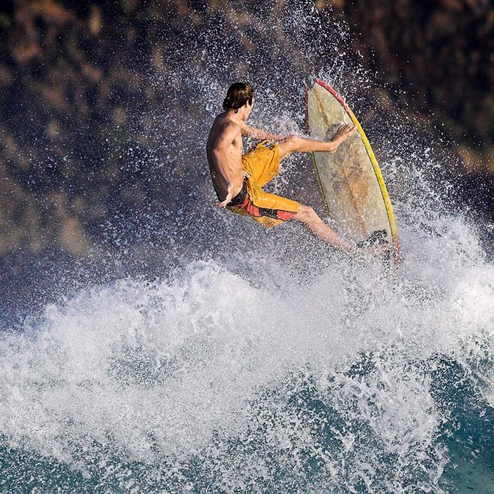
c. Dance performance: fast shutter speed, to capture the dancers' movements
d. People dancing in the courtyard: A little faster than average
e. People streaming in: slower would be cool if used to create a blur
f. basetball booth: fast shutter speed, because you want to capture the basketball 

Without sun and good light
a. Probably a faster shutter speed 
b. Also a slow one 
c. Fast shutter speed (lighting doesn't change because it's in the gym) 
d. Also a fast shutter speed 
e. Slower shutter speed
f. Faster

2. AV: Aperture priority makes it so you can choose the aperture, and the camera controls the shutter speed. 
TV: Shutter priority makes it so you can choose the the shutter speed, and the camera controls the aperture. 
M: Manual makes it so you can manually set aperture and shutter speed. 

ISO 200 

ISO 4000 

1. Having a higher ISO at sporting events allows for more light to be registered in an otherwise dark picture.
2. When you use a low ISO in a dark environment you should have it mounted on a tripod to capture a steady image. 
3. You should use a high ISO in fast action shots, or while shooting indoors without a flash. 

1. Aperture settings: f/2.8 to f/22
2. Shutter speed settings; 1 sec to 1/4000 sec
3. ISO settings: 100 to 256000 

Avoiding Mergers

Pic2

This photo avoids mergers because rather than the street and the chaos that was probably occurring being included in the shot, the photographer chose to capture the photo from a different angle, avoiding distraction.

Framing


This photo demonstrates framing. Through the broken wall, the attention is drawn to the firefighter.

Balance

Image result for famous photos of 9/11 ground zero

This photo uses geometric shapes to aid in composition. The angle of the photo made it possible for many different shapes to be seen in the picture.

Lines

This guy wasn't alone in seeking comfort in a familiar symbol after the attacks.

This photo demonstrates use of lines in composition. The stripes of the flag draw the attention to the face of the man, which is the focus of the picture.

Rule of Thirds


This photo demonstrates the rule of thirds. The firefighter is placed off center, which makes the picture more appealing and interesting to look at.

Simplicity

Suit

This photo demonstrates simplicity. The photo is focused on the man, and the background does not distract from the subject.